Comprehensive Brand & Design: Fragrance Collaboration (YOTR)
This project showcases my end-to-end involvement in a new product launch, demonstrating my ability to conceive innovative concepts, craft compelling copy, and execute diverse graphic design aesthetics. For this collaboration, I personally developed the unique scent notes for the new fragrance and created its memorable branding slogan. I then designed all accompanying promotional materials, bridging the distinct identities of 'Year of the Rat' (my own brand) and 'Simply Bails Co.'

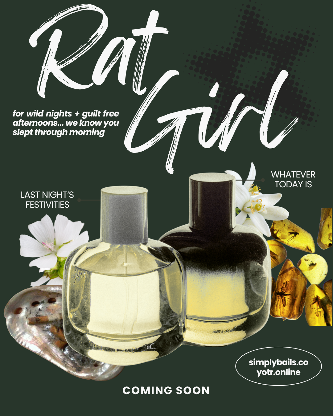
As the creative force behind this collaboration, I developed the unique scent notes for this new fragrance and crafted its distinctive branding slogan. This particular flyer was designed by me to embody a sophisticated and seamless blend, specifically catering to the client's (Simply Bails Co.) preference for refined elegance while subtly integrating my brand's core elements. Aesthetic & Client Alignment: Simply Bails Co. is a cocktail-inspired, all-natural, candle and fragrance small business, and this flyer's design reflects their brand identity. The deep dark green background provides an organic yet sophisticated backdrop, aligning with Simply Bails Co.'s natural aesthetic. The light gray/white cursive 'Rat Girl' typography was chosen for its elegance and softer appeal, bridging my edgier brand with the client's preference for a cleaner, more elevated visual. The integration of detailed white flowers, an abalone shell, and amber pieces further enhances this natural, luxurious feel, directly tying into the fragrance's concept. Copy & Narrative (My Creation): The whimsical phrase 'for wild nights + guilt free afternoons... we know you slept through morning' is the branding slogan I created for this product. It was designed to be engaging and embody its indulgent yet playful nature, appealing to both brands' audiences. Graphic Design & Synergy: This piece showcases my ability to meticulously integrate diverse visual elements—from the fluid cursive script and the subtle black halftone star (a nuanced nod to the 'Year of the Rat' brand) to the realistic product imagery and organic details—into a cohesive and aesthetically balanced composition. It exemplifies my skill in visual storytelling that gracefully balances multiple brand identities.
As the creative force behind this collaboration, I developed the unique scent notes for this new fragrance and crafted its distinctive branding slogan. This particular flyer was designed by me to embody a sophisticated and seamless blend, specifically catering to the client's (Simply Bails Co.) preference for refined elegance while subtly integrating my brand's core elements. Aesthetic & Client Alignment: The deep dark green background provides an organic yet sophisticated backdrop, aligning with Simply Bails Co.'s natural aesthetic. The light gray/white cursive 'Rat Girl' typography was chosen for its elegance and softer appeal, bridging my edgier brand with the client's preference for a cleaner, more elevated visual. The integration of detailed white flowers, an abalone shell, and amber pieces further enhances this natural, luxurious feel, directly tying into the fragrance's concept. Copy & Narrative (My Creation): The whimsical phrase 'for wild nights + guilt free afternoons... we know you slept through morning' is the branding slogan I created for this product. It was designed to be engaging and embody its indulgent yet playful nature, appealing to both brands' audiences. Graphic Design & Synergy: This piece showcases my ability to meticulously integrate diverse visual elements—from the fluid cursive script and the subtle black halftone star (a nuanced nod to the 'Year of the Rat' brand) to the realistic product imagery and organic details—into a cohesive and aesthetically balanced composition. It exemplifies my skill in visual storytelling that gracefully balances multiple brand identities.

As the creator of the scent notes and the branding slogan for this fragrance, I also designed this flyer to powerfully extend the 'Year of the Rat' brand's unique identity while promoting the collaborative scent. Aesthetic & Brand Alignment: This flyer is a direct representation of 'Year of the Rat's' core aesthetic. The high-contrast black background coupled with the distressed, blocky white 'Rat Girl' typography immediately communicates the brand's raw, edgy, and impactful personality. This design ensures visual consistency across my portfolio and directly appeals to the YOTR fanbase. Copy & Assertive Messaging (My Creation): The collaborative phrase 'for wild nights + guilt free afternoons... we know you slept through morning' – the branding slogan I developed – is delivered with an assertive, raw tone, thanks to the distressed font, perfectly aligning with the bold and unapologetic voice of 'Year of the Rat'. Graphic Design & Impactful Branding: This piece highlights my expertise in utilizing strong typographic choices, impactful color contrast, and a prominent graphic element like the vibrant pink halftone star. The composition is designed for maximum visual punch, proving my capability in creating designs that are not only commercially effective but also deeply rooted in a brand's unique personality and my overall creative vision for the product.